- Pitangoux is now Triolla –
We’ve rebranded! Hello and welcome!


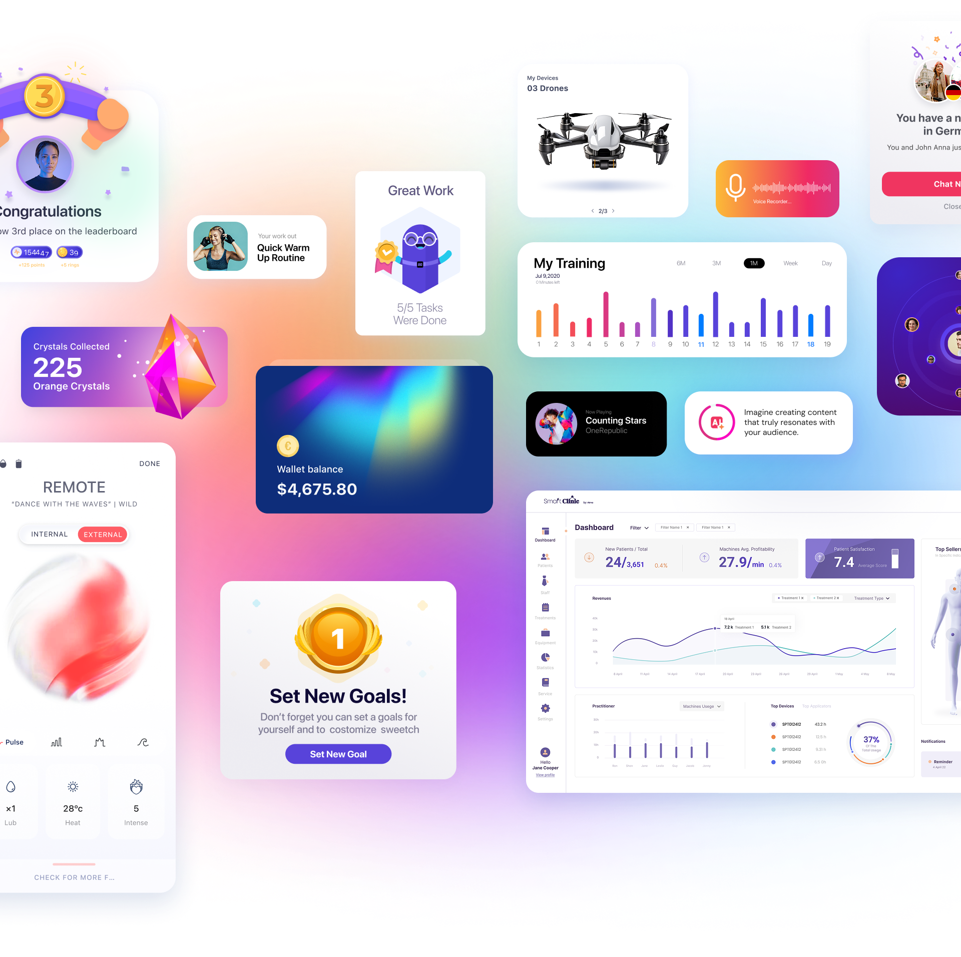
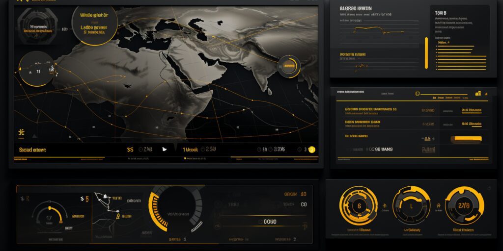
We interact with dashboards constantly—from morning check-ins to end-of-day reports, dashboards have become the unsung heroes of our professional lives, especially as the world shifts to a post-pandemic hybrid work model. At Triolla, as leading UX designers serving Israeli and international startups and enterprises, we believe in the power of a well-structured dashboard. Let’s dive into the art and science behind creating an exceptional dashboard user interface and see how top brands succeed by leveraging this tool.
The Origins of a Successful Dashboard
Ever wondered where the term “dashboard” comes from? The concept began in aviation and aerospace, where pilots and astronauts rely on control systems, but it was the automotive industry that made the term popular. Traditionally, a dashboard referred to a panel displaying vital stats like speed, fuel, and temperature.
With the digital age in full swing since the early 2000s, the idea of a dashboard evolved. In the world of UX/UI, it represents a digital interface that displays real-time key performance indicators (KPIs). This is where decision-makers can feel the pulse of their organization, thanks to visually relevant, consolidated data.
Mobile devices, innovative design options, and advanced data visualization—like heat maps—have since ushered in an era where dashboard interfaces are more sophisticated yet more user-friendly than ever.
A Dashboard: Much More Than Just a Pretty Interface
Despite evolving designs and trends, the core purpose of dashboard UI design remains unchanged:
- Providing a concise, clear snapshot of essential business metrics.
- Presenting data in a way that enables clients to make informed decisions efficiently.
By adhering to design conventions and best practices, designers in our UX studio—and around the world—can create dashboards that blend functionality with creativity. Think of it as a dedicated tool guiding your business toward its goals.
Why Do Modern Dashboards Look So Similar?
You may have noticed that many modern dashboards look like they came from the same UI design folder. Why is that?
-
Strict Standards and Best Practices:
Over the years, certain non-negotiable standards have been established for dashboards. From clear navigation and labeling to relevant data visualizations, designers who follow these guidelines may inadvertently create similar-looking interfaces. -
Meeting User Expectations:
Users now expect specific features from dashboards—like data drill-downs, customizable views, and filtering options—so designers work to include these elements. A user-centered design approach can sometimes result in a “family resemblance” among dashboard UIs. -
Design Constraints:
Displaying large amounts of data in a limited space is no easy task. This often forces designers to adopt a minimalist approach, which can again lead to similar aesthetics. -
Usability Above All:
At the heart of an effective dashboard UI is its ability to make data comprehension simple. As a result, designers often prioritize user-friendly features over purely aesthetic elements, leading to certain similarities in UI design.
However, it’s the individual touches that can make your dashboard UI stand out. While the basic structure may be standard, the use of unique branding elements, innovative typography, and color schemes can infuse your dashboard with distinctiveness.
At Triolla Studio, our expert UX designers prioritize creating custom, optimally tailored user interfaces for each client’s needs. We don’t just fit the mold—we break it. In a sea of similarities, it’s those unique touches that make all the difference.